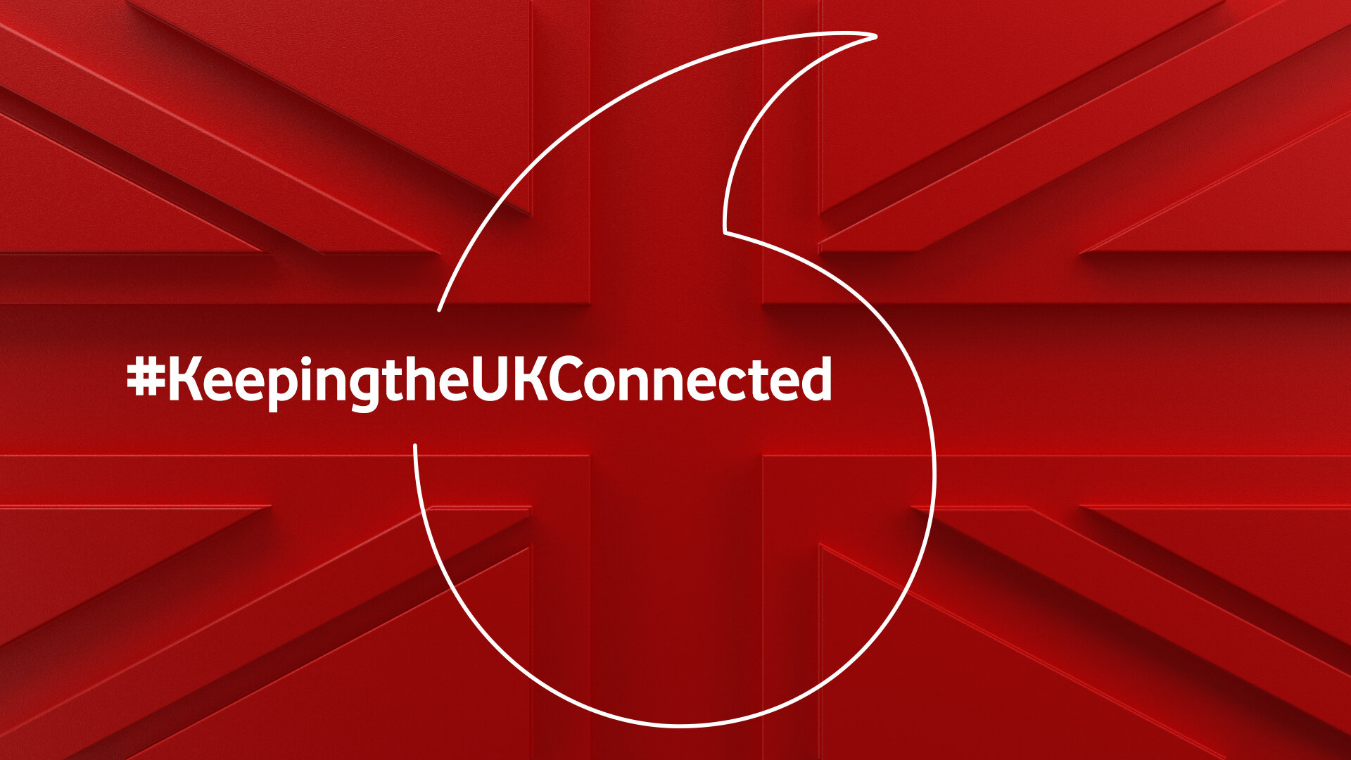
Keep Connecting
I’ve led the messaging for Vodafone’s response to the Coronavirus pandemic since March. I also manage Vodafone’s COVID-19 hub. I had it designed and built in two days and update it as the virus develops.
A page, and all campaign messaging
I worked with senior stakeholders, designers, and UX specialists to build the page, and now lead its evolution according to shifting priorities during the ongoing COVID-19 pandemic. I led the team through the page’s initial ideation to build in under two days, and coordinate each new iteration of the page.
The campaign evolves alongside the geopolitical situation. The page acted as a focal point for all the COVID-related campaigns we run.
Copy, design, and content in the time of COVID

I worked with senior graphic designers and UX specialists to oversee initial wireframing. I then led art direction of visual creative and established a cohesive user experience at the design phase. Then, the page was built by our team of content editors.
As it developed, the page married various charity endeavours, brand considerations, relevant information, new campaigns, and business messaging. Vodafone’s content takes a variety of shapes - such as articles, videos, letters, and so on. It was my responsibility to ensure that the page remains formally and functionally cohesive.
I balanced the various requests that come in from across the business (from the CEO of Vodafone UK to our Head of Brand). I carefully appraised the many content demands that come in to maintain a coherent user experience for all visitors.
The page included latest important updates from across the business, bespoke banners for the various COVID-19-related campaigns Vodafone runs (like VOXI For Now), partnerships (with The Guardian Labs and the British Red Cross, for example), and Vodafone’s charity initiative DreamLab.
We also signposted helpful links and information for people who work from home, and those who rely on their phone to keep in touch with the people they love during the pandemic.
UX-first, always
UX is at the heart of the page’s design.
There are two on-page navigation bars. The first aids on-page content navigation:

The second helps existing customers get in touch with our agents or our support community.

And the rest of the page
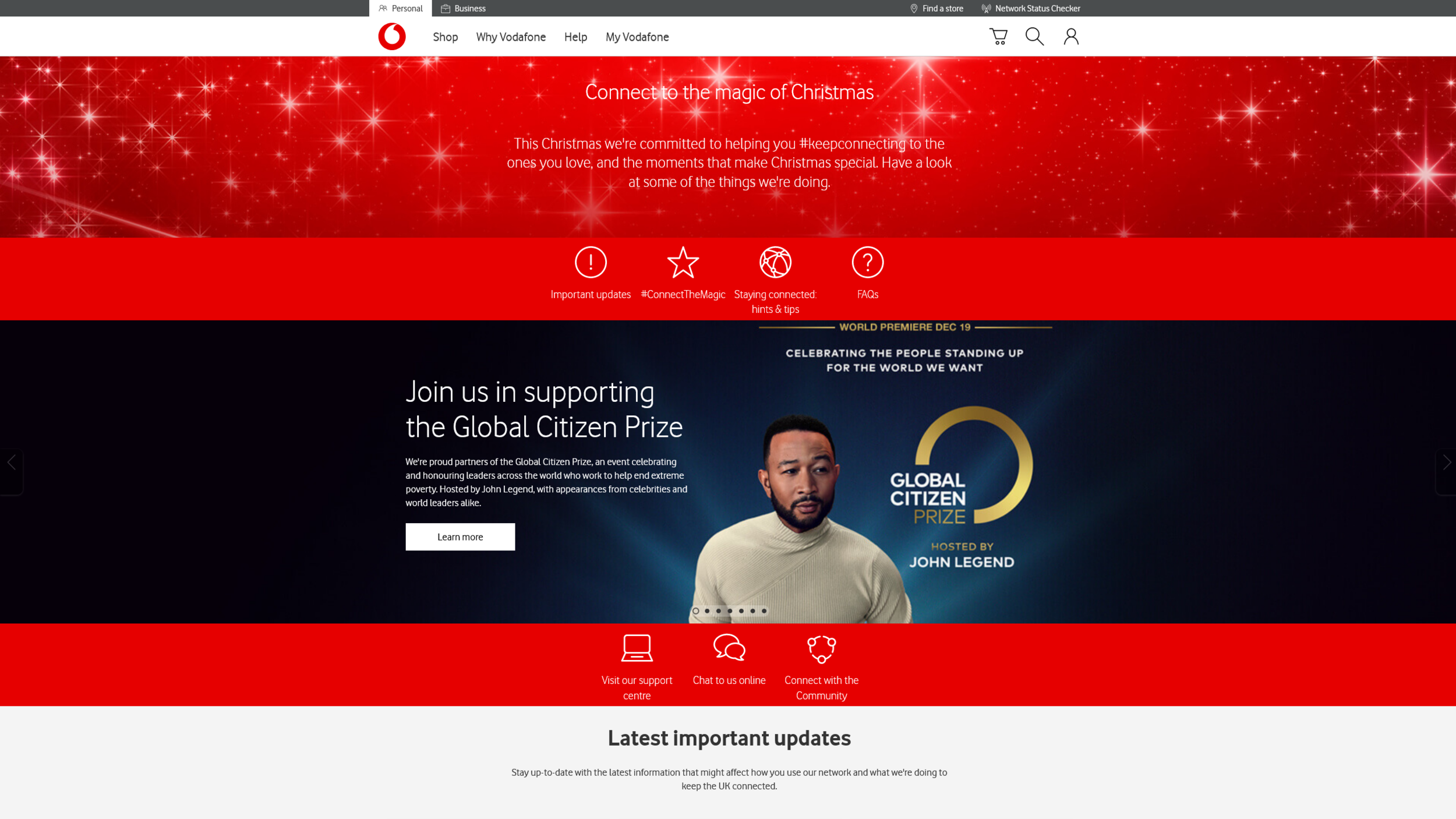
Above the fold. Beneath the festive hero banner sits the first navigation bar, which directs users to various bits of content.

A carousel of relevant articles and important updates.

Our TV ad for this Christmas - the story of Marlowe and Uma.

Light Up was one of our Christmas initiatives. Children submitted their Christmas cards, and we projected them onto a building using the magic of Christmas (a.k.a. 5G).

Some resources for anyone working from home during the pandemic, or anyone who relies on their phone.

More support - this time in the form of FAQs.

And finally, a message from the Vodafone UK CEO.
Eight months after launch, the page still saw tens of thousands of weekly visitors.